FedEx Rate Calculator, Simplified
One-line summary
I redesigned the rate calculator flow so customers could get a fast quote, avoid mistakes, and pick an option without feeling overwhelmed.
The Problem
Too many questions upfront, even when users did not have all the details.
The order of fields felt random, so people hesitated and second-guessed.
Results showed too much at once, which made choosing harder.
Mobile entry was frustrating, and errors felt punishing.
The Solution
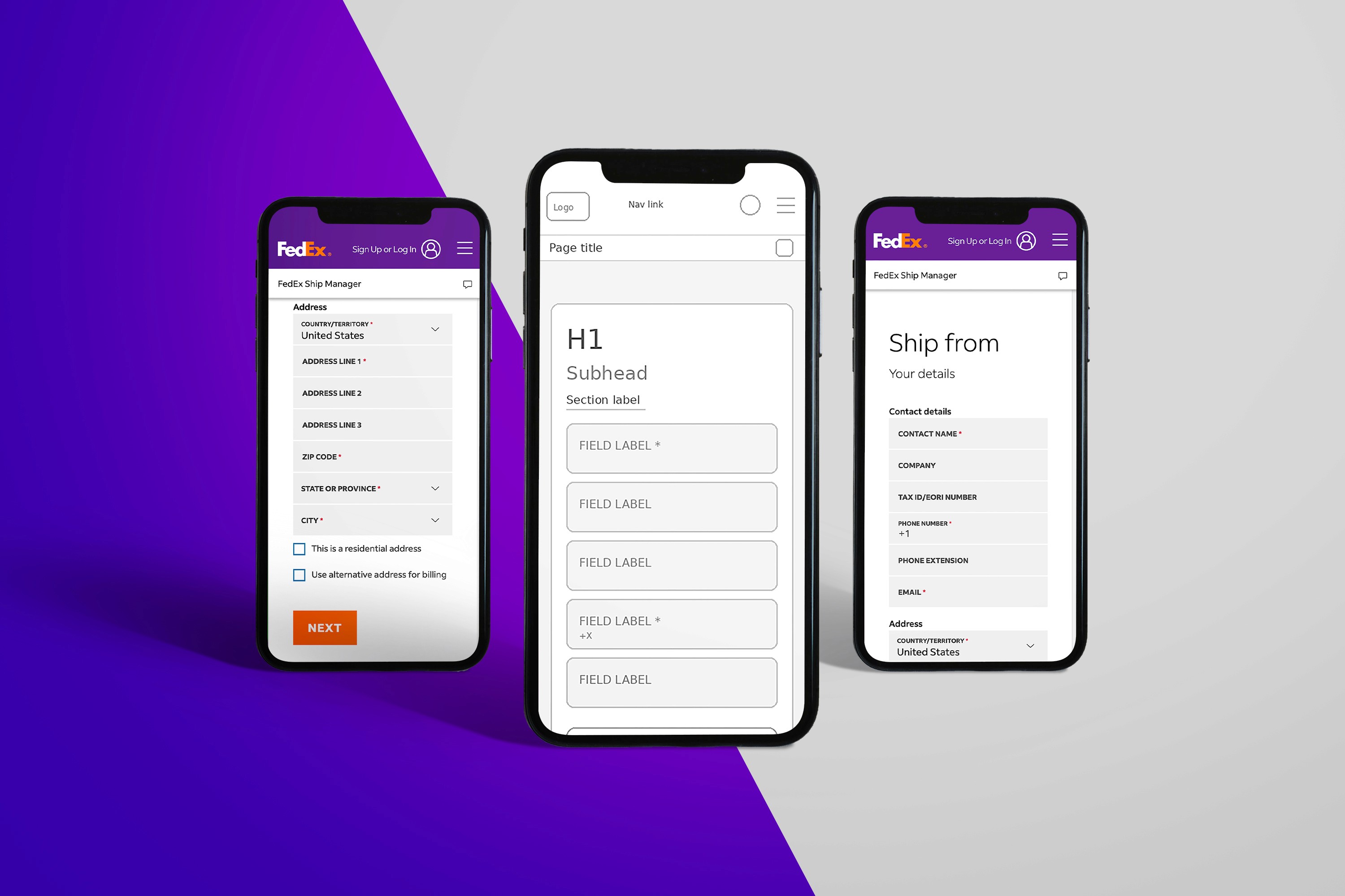
Built a fast quote path using only the basics: origin ZIP, destination ZIP, package type, and weight.
Organized the form the way people think: From and To, Package, Timing.
Revealed extra questions only when needed, instead of forcing everything upfront.
Redesigned results into clear choices with labels like best overall, fastest, and lowest cost.
Improved mobile inputs with better keyboards, easier date picking, and a sticky main action button.
Added inline validation and clear error messages that tell you exactly what to fix.
My Role
Senior UI/UX Designer leading the UX restructure, interaction design, and responsive and accessibility improvements.
What I Delivered
Responsive page redesign for the rate calculator
Form flow and layout specifications
Interaction states and validation patterns
Error messaging set and field behavior rules
Results layout and option card designs
Accessibility and responsive handoff notes
Impact
Faster path to a first quote, with fewer required inputs upfront.
Less decision overload by turning results into clear options.
Fewer mobile errors with more forgiving input patterns and clearer fixes.
More confident selections because options are framed around common priorities.
Lessons / What I’d Improve Next Time
Add analytics goals upfront so success is measurable (completion rate, error rate, time to quote).
Run quick usability tests on the results labels to confirm people interpret them the same way.
Validate edge cases early, like international addresses and unusual package types.
Tools
Figma, responsive design specs, accessibility guidelines
Category:
UI/UX
Client:
FedEx
Duration:
2 years
Location:
Memphis, TN (Remote)