Lowe’s Mobile Shopping, Simplified
One-line summary
I audited Lowe’s mobile experience and created a redesign direction that helps people find products faster, feel confident buying, and get through checkout with fewer surprises.
The Problem
Finding products takes too many steps and too much backtracking.
Promos and extra content compete with the main actions, like search and departments.
Product pages make people scroll too far to find availability, pickup and delivery, and key specs.
Checkout adds friction with confusing fulfillment options, long forms, and sign-in interruptions.
The Solution
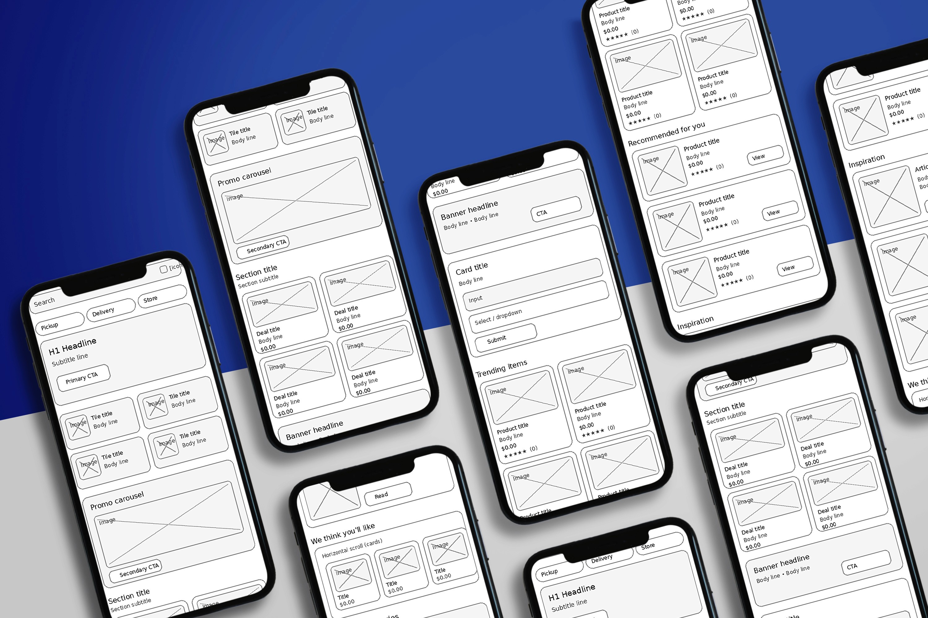
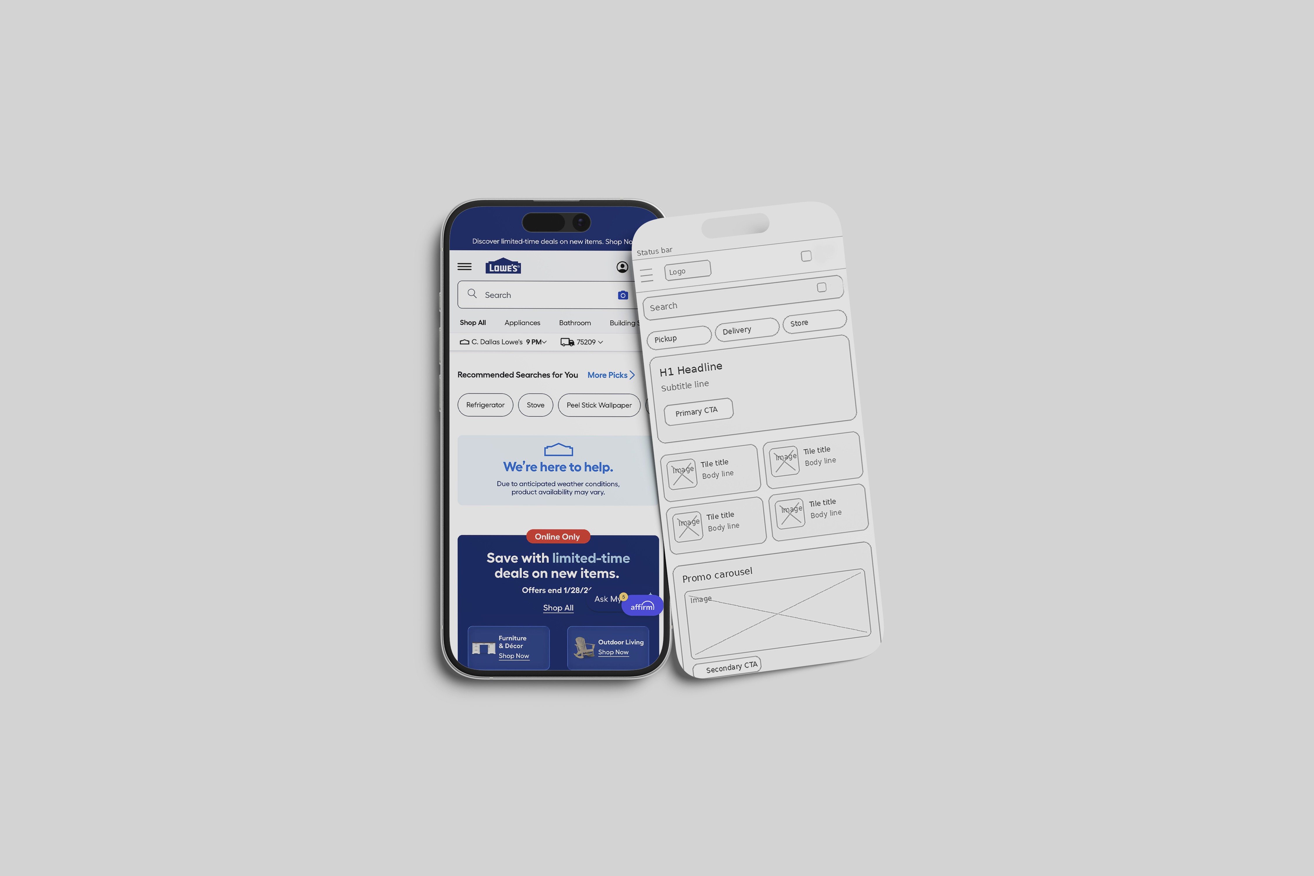
Made search the main entry point with quick actions like shop by department, reorder, track order, and nearby store.
Simplified department browsing with a clean grid, clear breadcrumbs, and an easy way to return to results.
Improved product listings with a sticky refine bar (sort, filters, pickup and delivery) and clear filter chips that show what is applied.
Strengthened product cards so shoppers can compare faster using price, rating, availability, and key info at a glance.
Rebuilt the product page layout so the most important decision info shows early: price, rating, promos, fulfillment, store availability, and key specs.
Clarified checkout by grouping items by fulfillment type and reducing form pain with autofill-friendly inputs and fewer interruptions.
My Role
Senior UI/UX Designer leading the UX audit, redesign direction, and mobile interaction patterns.
What I Delivered
UX audit findings and problem framing
Mobile information architecture updates
Component and pattern recommendations (search header, filter sheet, sticky add to cart, fulfillment modules)
Concept wireframes and screen designs for homepage, navigation, listings, product page, cart, and checkout
Caption plan for presenting screens in a case study
Impact
Faster time to reach the right product through cleaner search and browsing paths.
Better product confidence by surfacing availability, fulfillment, and key specs earlier.
More add-to-cart intent by making the product page easier to scan and decide.
Lower checkout drop-off risk by reducing confusion around pickup, delivery, and shipping.
Lessons / What I’d Improve Next Time
Validate the new layouts with quick mobile usability tests in real contexts like in-store and on job sites.
A B test the product card details to confirm which info improves decisions without clutter.
Test guest checkout and sign-in timing to reduce interruptions while still supporting loyalty goals.
Tools
Figma, FigJam
Category:
UI/UX
Client:
Lowes
Duration:
1 year
Location:
Dallas, TX (Remote)