Gartner Homepage, Made Clear
One-line summary
Redesigned the homepage to cut confusion and help people find the right Gartner path fast, without losing trust.
The Problem
Too many audiences were competing for attention, so the page felt crowded.
People could not quickly choose the right path (research, events, consulting).
The top of the page had mixed messages, which weakened trust.
Mobile felt like a squeezed desktop page, with key actions harder to reach.
The Solution
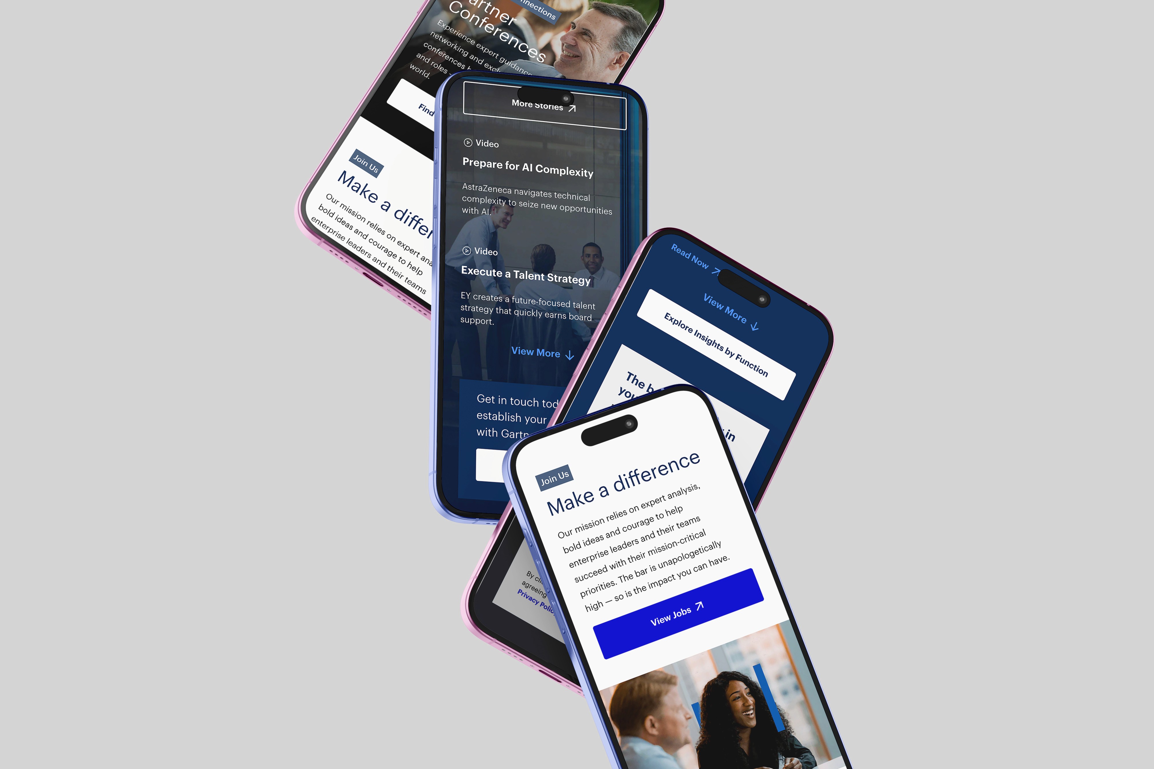
Rebuilt the page around clear user intent, so visitors can choose a path in seconds.
Simplified the top section to one main message with one primary action.
Brought trust signals higher on the page without adding clutter.
Designed mobile-first modules that are easy to scan and easy to tap.
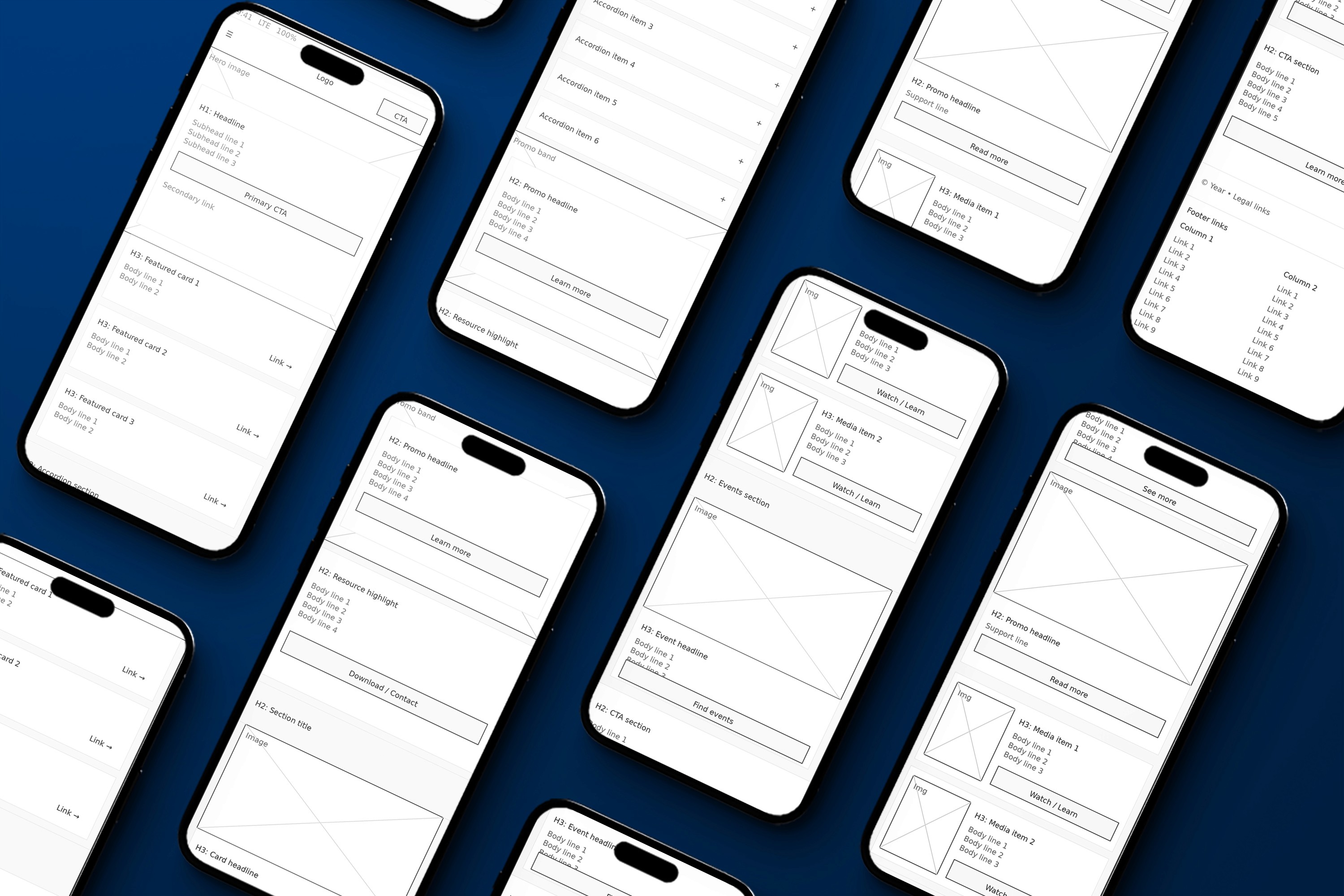
Used component-based sections so content can scale without breaking consistency.
My Role
Senior UI/UX Designer leading homepage UX strategy, UI design, prototyping, and handoff.
What I Delivered
Information architecture (intent-based structure)
Wireframes
High-fidelity responsive UI designs
Component-based module designs
Interactive prototype
Developer handoff specs and assets
Impact
Clearer homepage structure that guides visitors to the right entry point faster.
Stronger hierarchy above the fold, improving comprehension and confidence.
Mobile experience became more usable with reachable, tap-friendly actions.
Content became easier to maintain through reusable modules.
Lessons / What I’d Improve Next Time
Add quick usability tests earlier to validate the main paths before UI polish.
Push for even tighter content rules so new modules do not reintroduce clutter.
Track a small set of homepage success metrics from day one (click paths, bounce, scroll depth).
Tools
Figma, FigJam, prototyping tools, Jira, Confluence
Category:
UI/UX
Client:
Gartner Inc
Duration:
1 year
Location:
Stamford, CT (Remote)